Sadly, vacation is over. No more halcyon days of sleeping in, stumbling to the kitchen to make coffee before I spent the morning in my comfy chair with a book. Afternoons of puttering, painting, and piano; working in the kitchen with Cory to make tasty dinners…It was a good vacation!
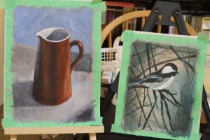
However, before it was over I did manage to finish my next painting project.
Next up: How to paint a warm & cool still life painting (using only 2 colours) Tutorial from http://willkempartschool.com/.
Colour theory and colour mixing is something I need to learn about. Somewhere in the basement storage closet there is a box of my old art stuff, and in there is a colour wheel. I keep thinking I need to try and find that box, but it’s scary in there.
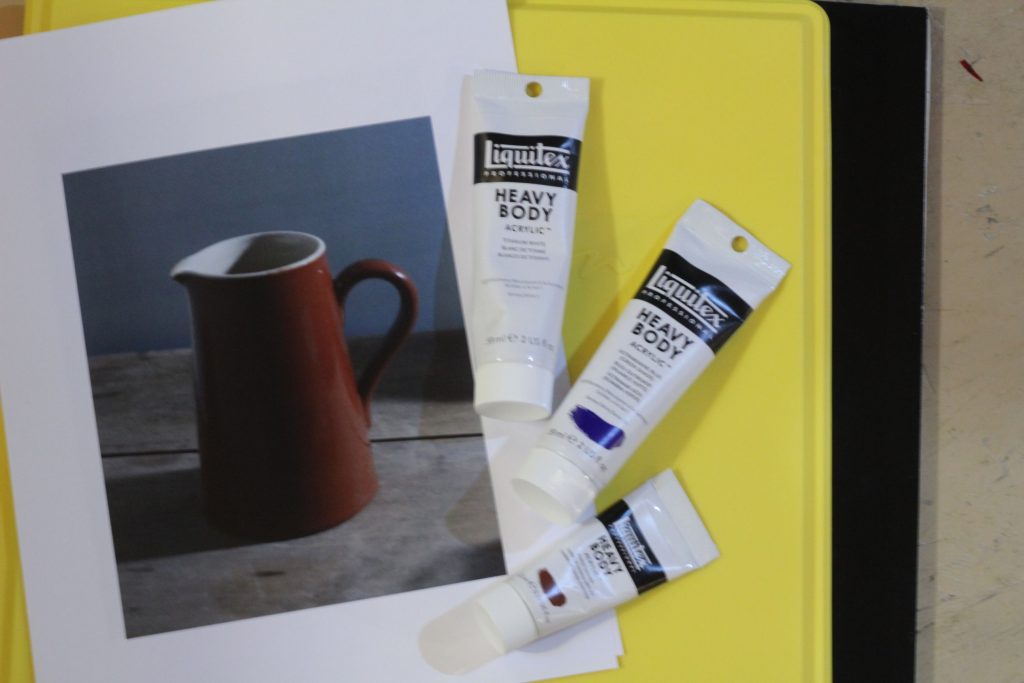
This video lesson uses 2 colours plus white: Burnt Sienna and Ultramarine Blue. Sounds easy, right?
Before I start:
- I printed out the reference image this time
- I watched the videos through one time before I started, then watched and painted along with each lesson.
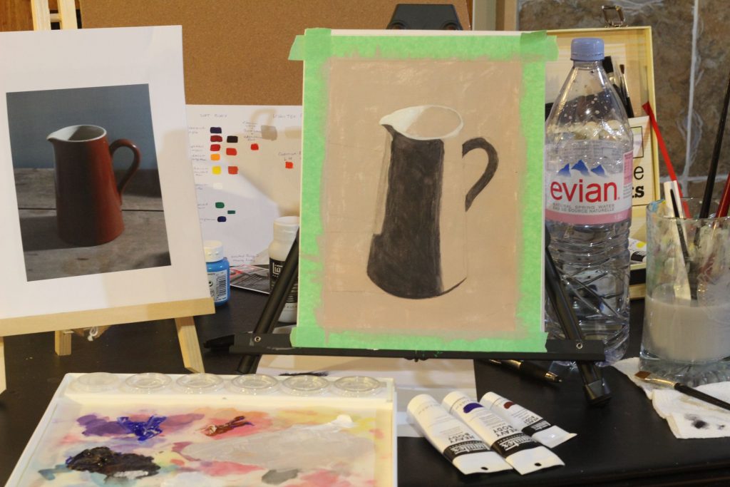
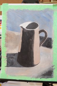
Lesson 1 thoughts:
- Last time the base colour was too light, this time I think it was too dark?
- My drawing skills are terrible!
- Need better light. This was late afternoon, which is getting pretty dark this time of year, and I definitely noticed it made things more difficult.
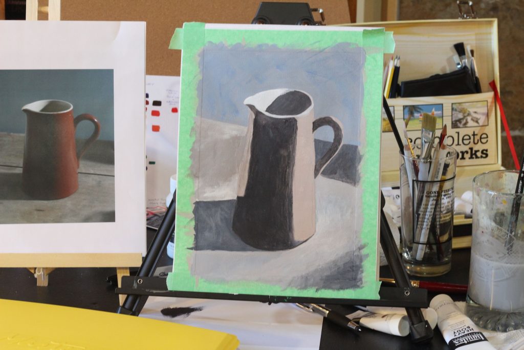
Lesson 2 thoughts:
- This is not going well.
- The light! It’s killing me.
- Was not happy with where I ended up. Particularly the colour on the table top. Then I walked away for a few minutes, and when I came back I actually looked at the reference image. I was trying to look back and forth between what was happening on the video, and the original picture, but somehow it was easier to really look at it when I was not comparing to the video. So made a few adjustments (though after the photo was taken), a little bit happier, but thought I’d better stop there because you can mess things up by trying to do too much.
- Seems like a good time for a yoga break.
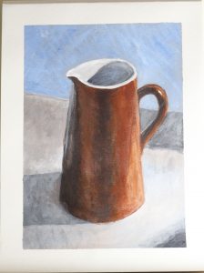
Lesson 3 thoughts:
- Changed to a different type of light bulb in my lamp; ceiling lights are still not great, but this is a little better.
- The more I work on this, the more obvious the drawing errors are; the jug is all out of proportion, the angle on the edge of the table is too steep.
- I tend to want to paint clean, sharp edges; not necessary in this painting, and maybe better if I had not. Too solid filling in the shadow/dark areas. Was not happy with the table top at all.
- Lost it again at the end, when finishing touches/highlights were being added. It seemed fine when I was watching, but the watching painting at the same time doesn’t go so well. When it’s one section at a time, I watch, pause to do some work, then start it up again. Need to work out how to tackle the end bits.
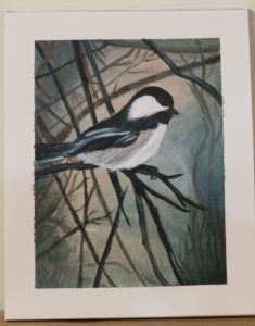
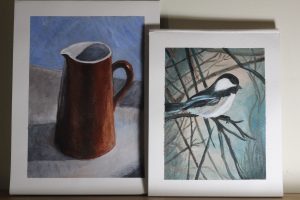
The Jug tutorial felt like a bit of a fail. But I remain undaunted! I decided to experiment further with the Two Colour palette. I chose Burnt Umber and Phthalo Blue (green shade) and dove right in.
Results:
- Not the best colour choices, I think, but it still sort of worked out.
- I got lost in the weeds – literally. I couldn’t quite figure out what I wanted/how to make it work.
- Too much paint on this canvas, trying to correct things, and I ended up letting my paint dry out a bit which just made things harder.
- I will try this one again, eventually.
Haven’t decided on the next project yet, but hopefully it will be soon!

